SanWu Drama Club
Mobile & Desktop official website design for Chinese Drama Club in University of California, San Diego.


Overview
Team size: 4
My role: researcher, sketching, prototyping, visual design
Tool used: Figma
Duration: 2 months
About SanWu
SanWu Drama Club, also known as Chinese Drama Club(CDC), is a student organization at UCSD founded in 2017. They have several great shows on campus in the past two years with an audience size of 200. Each quarter, they organize drama related activities and present their latest drama. They would like to have an official website to showcase their previous shows and attract more people to join them. My team cooperated with CDC and designed both desktop and mobile web pages for the organization.


Research
Needs of the Stakeholder
To ensure our design fulfill our client’s needs, we arranged an in-depth talk with CDC’s president and marketing committee chair. From the talk, we concluded their major requirements as follows:

Needs of the Potential Customers
After analyzing the needs of the stakeholder, we narrowed down the potential customers of the website into three categories:
Core Member of CDC
Passionate Theater Audience
Potential New Member of CDC
We conducted semi-structured interviews with 9 volunteers in total, 3 for each category, analyzed their needs and expectation of the website using affinity modeling and built 3 personas to assist with design:


Competitive Analysis
To learn the market trends and to get inspiration for our design, we researched on and analyzed 2 Chinese organizations’ official sites:

And 3 drama related organizations’ official sites:

We analyzed them in five aspects including Branding, Functionality, Content, Site Architecture, and Design.

And learned from them:

Bottom Lines
Based on our research, we concluded 3 bottom lines for our design:
Potential newcomers can learn about the club as quick as possible
Passionate audience can get the information about the club’s latest show as quick as possible
Core members can get clear and quick access to their information
Design
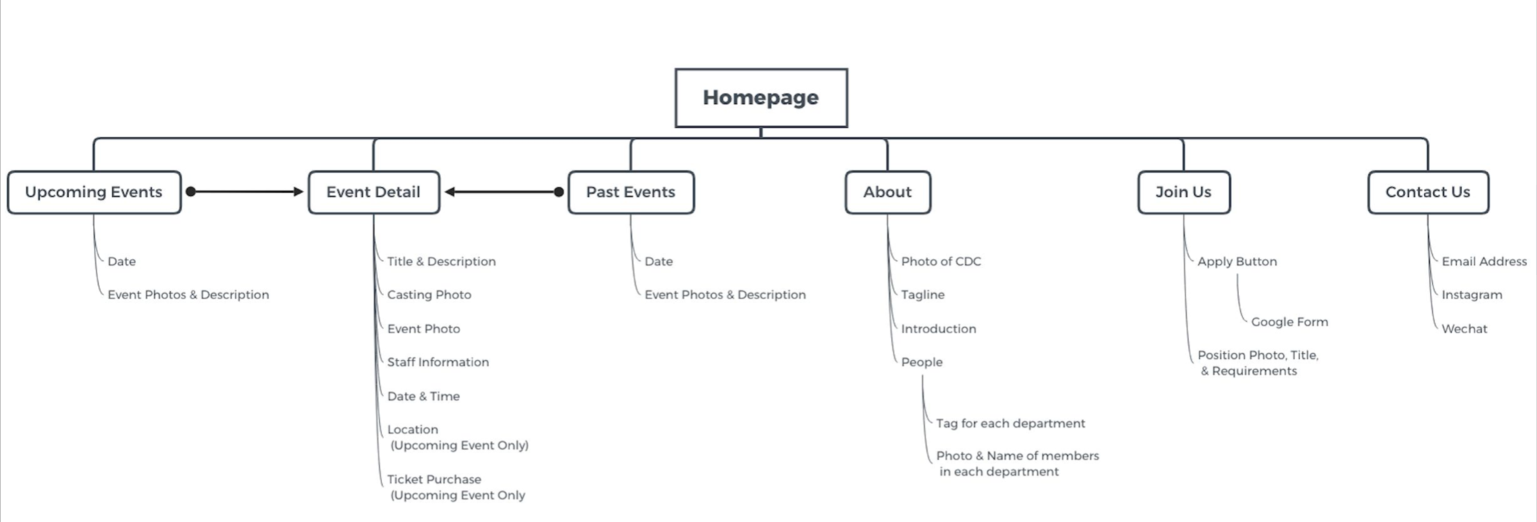
System Flow
Sketches & Low-Fidelity Prototype
Sketches:

Low-Fidelity Prototype:

How We Meet Our Bottom Lines
Potential newcomers can learn about the club as quick as possible:
Passionate audience can get the information about club’s latest show as quick as possible

Core members can get clear and quick access to their information

Usability Test
To find out what part of our design worked and what didn’t, we performed on-site speak aloud test with 4 potential users.
Key Findings:
3 out of 4 subjects reports there is too much content on each page which makes them confusing,
2 out of 4 subjects reports they don’t know the purpose of the site only looking at the landing page,
2 out of 4 subjects make wrong predictions when we ask them to predict the contents of a page from its label in the hamburger menu.
How did we improve:
It might be better to reduce the word amount of a page and to distinguish the text size to highlight the text hierarchy.

Making photos swipe left and right can reduce the congestion of the interface and allow users to freely control which photos and the number of photos they want to browse.

The purpose of the club should be shown more straightforwardly on the homepage, putting a video about dramas by the club might be helpful.

Changing the word choice for the hamburger menu will make our users understand the contents in each page better, the word should be chosen on the bases that implying all possible contents of the page.

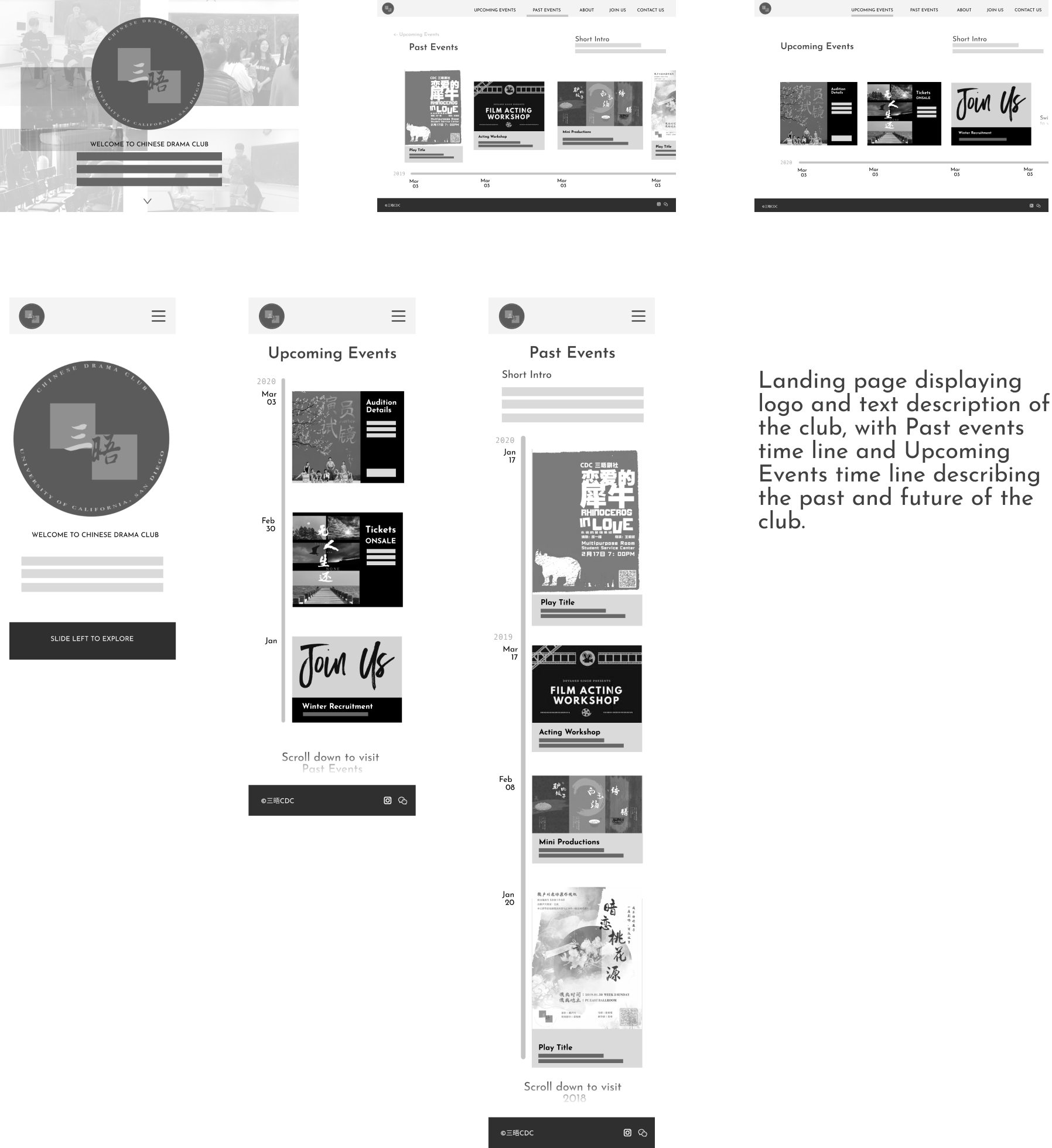
Final Design
Reflection
This was the first time I do a research & design project with the inclusion of both a stakeholder and customers. The experience was new to me because often time there were conflicts between the need of users and the requirement of the stakeholder, e.g. the stakeholder wants to show its sponsors in a more visible position, while most customers want to have the interface as concise as possible. Having the involvement of the stakeholder throughout the research and design phase really helped us to make sure what is the bottom line of the stakeholder and what is the biggest benefit I can get for the customers, which made our design more reasonable to both the stakeholder and the customers.


